Ember Lane Candle
Branding & Packaging Design
Created all branding for local candle company - logo, packaging design, product mockups.
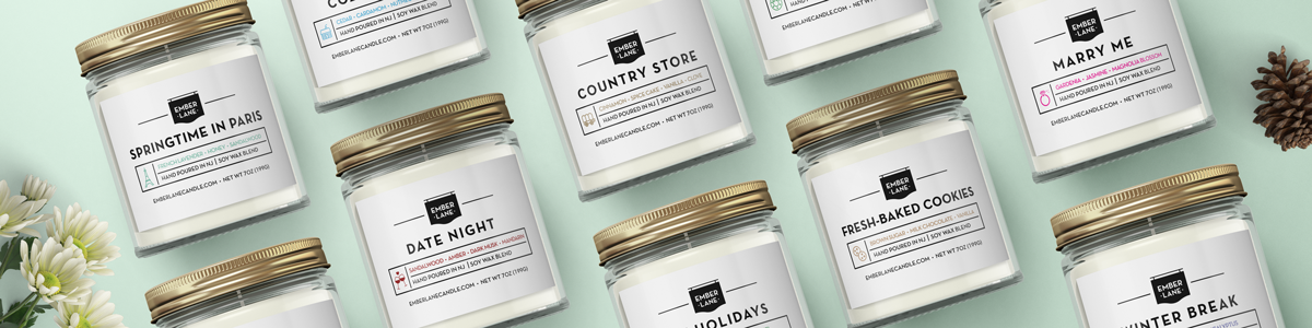
The logo was designed to convey the image of a local, homey business - utilizing an old school store sign as the base, and a classic/bold sans serif font. I decided to keep the logo's color as black and white - because each scent would have its own signature color, it needed to work with all of them.

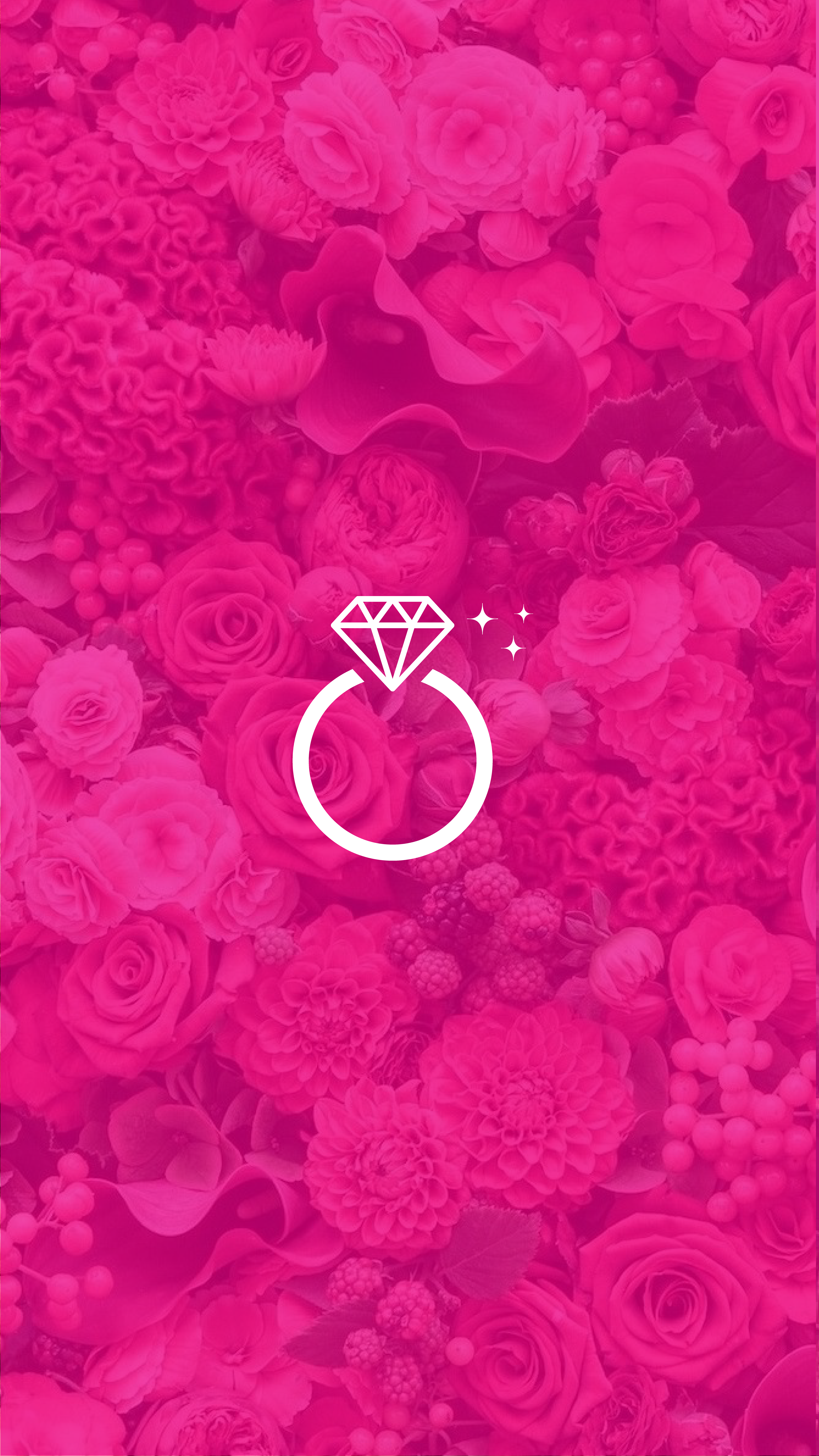
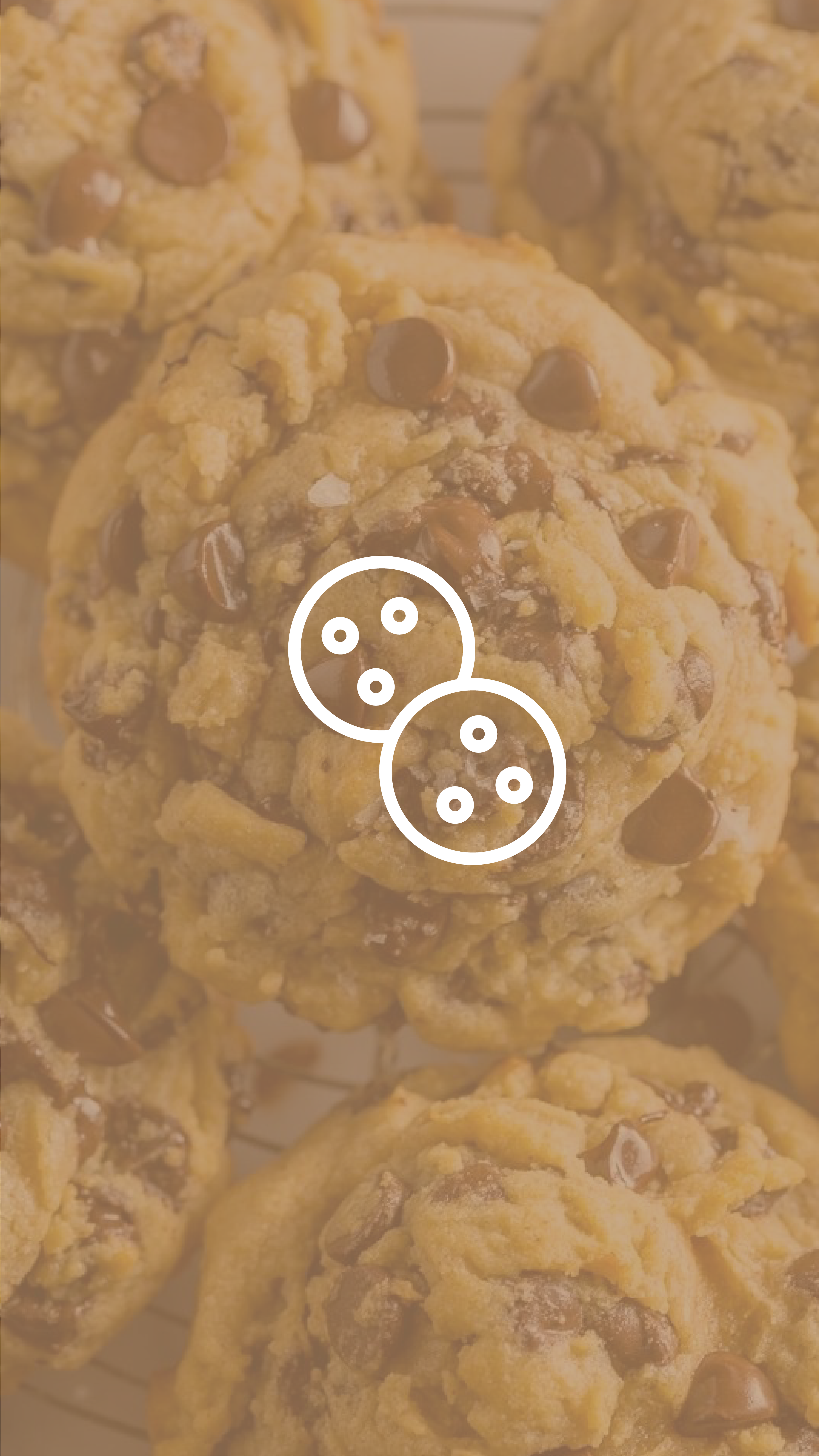
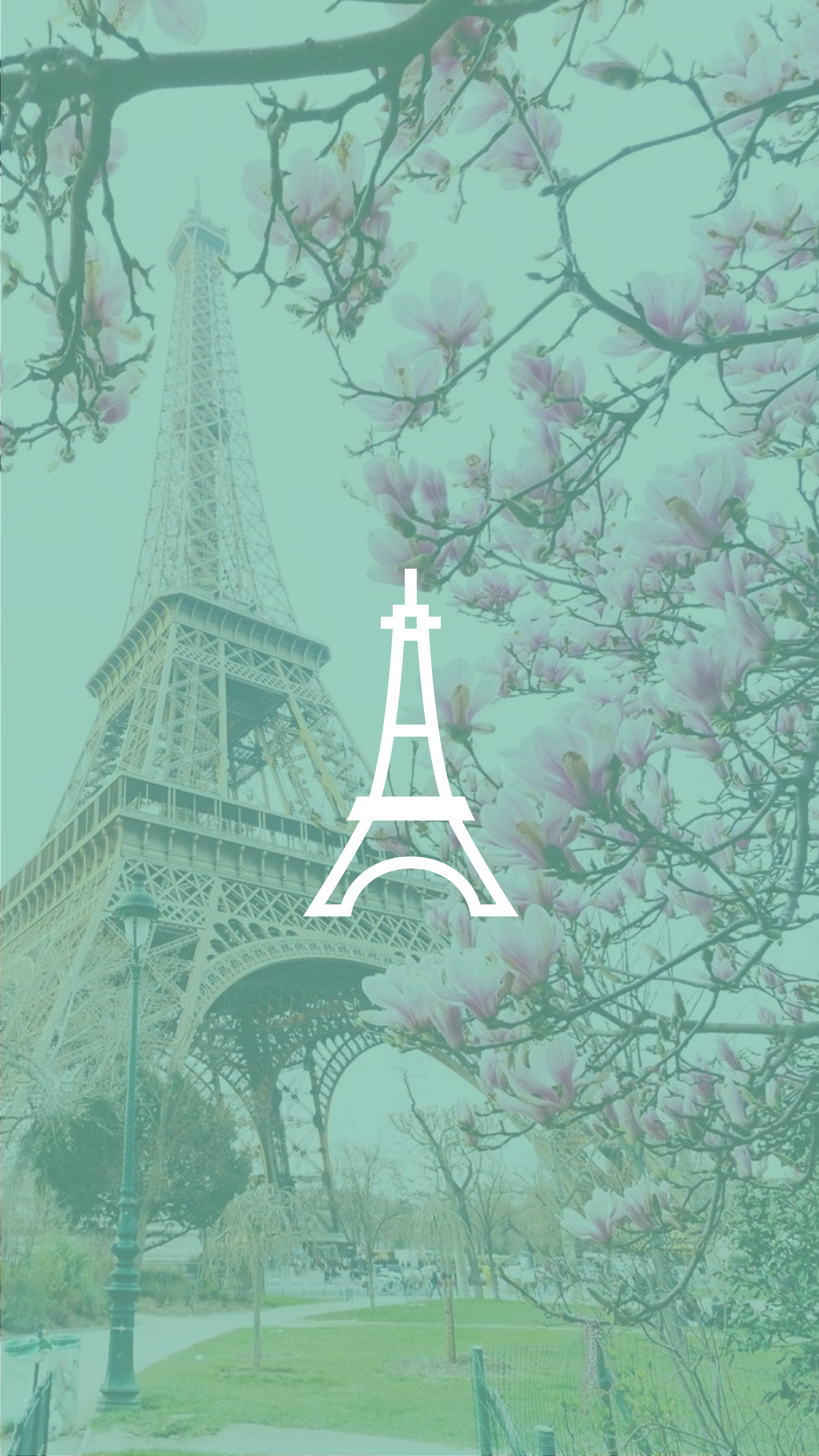
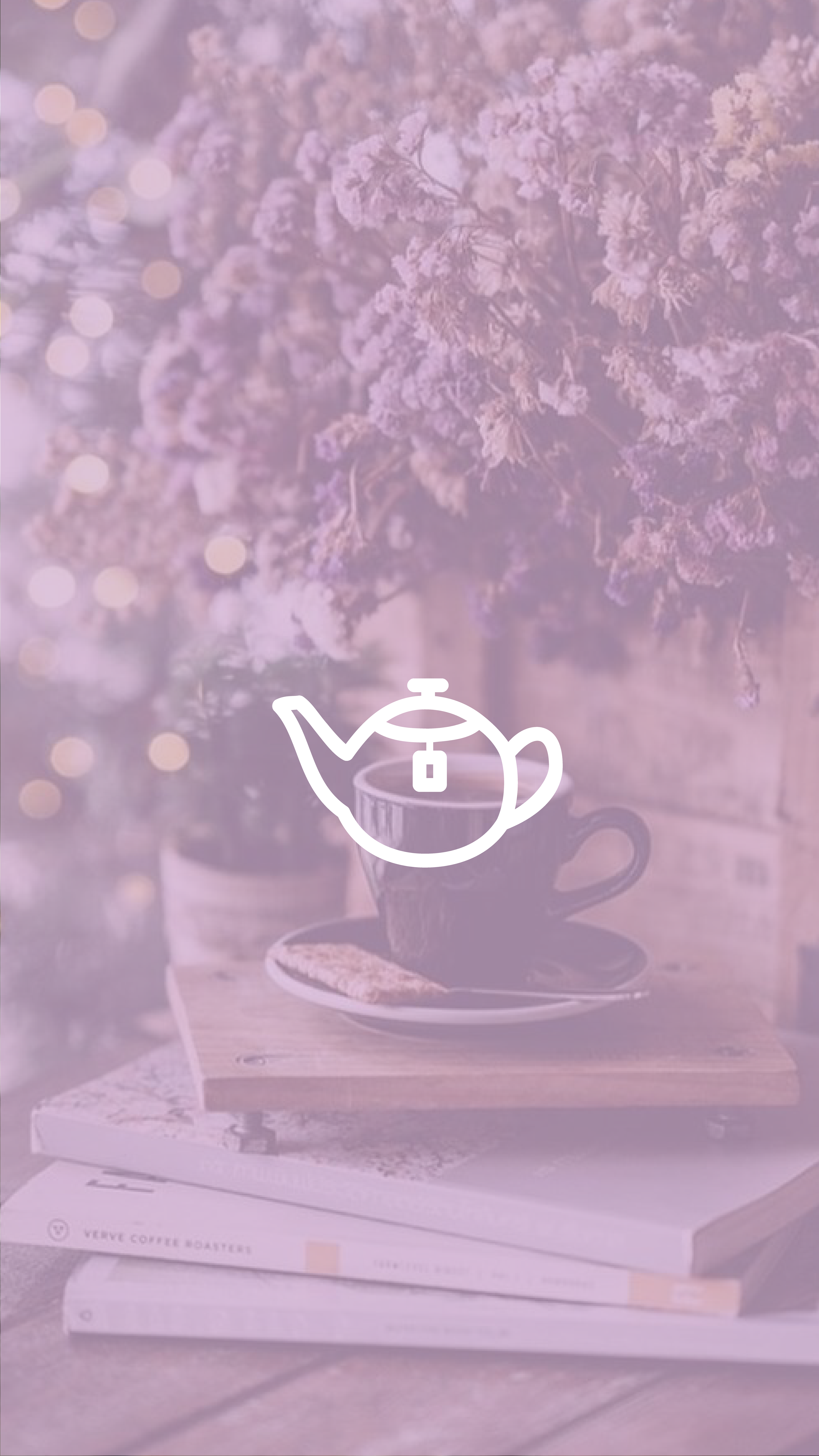
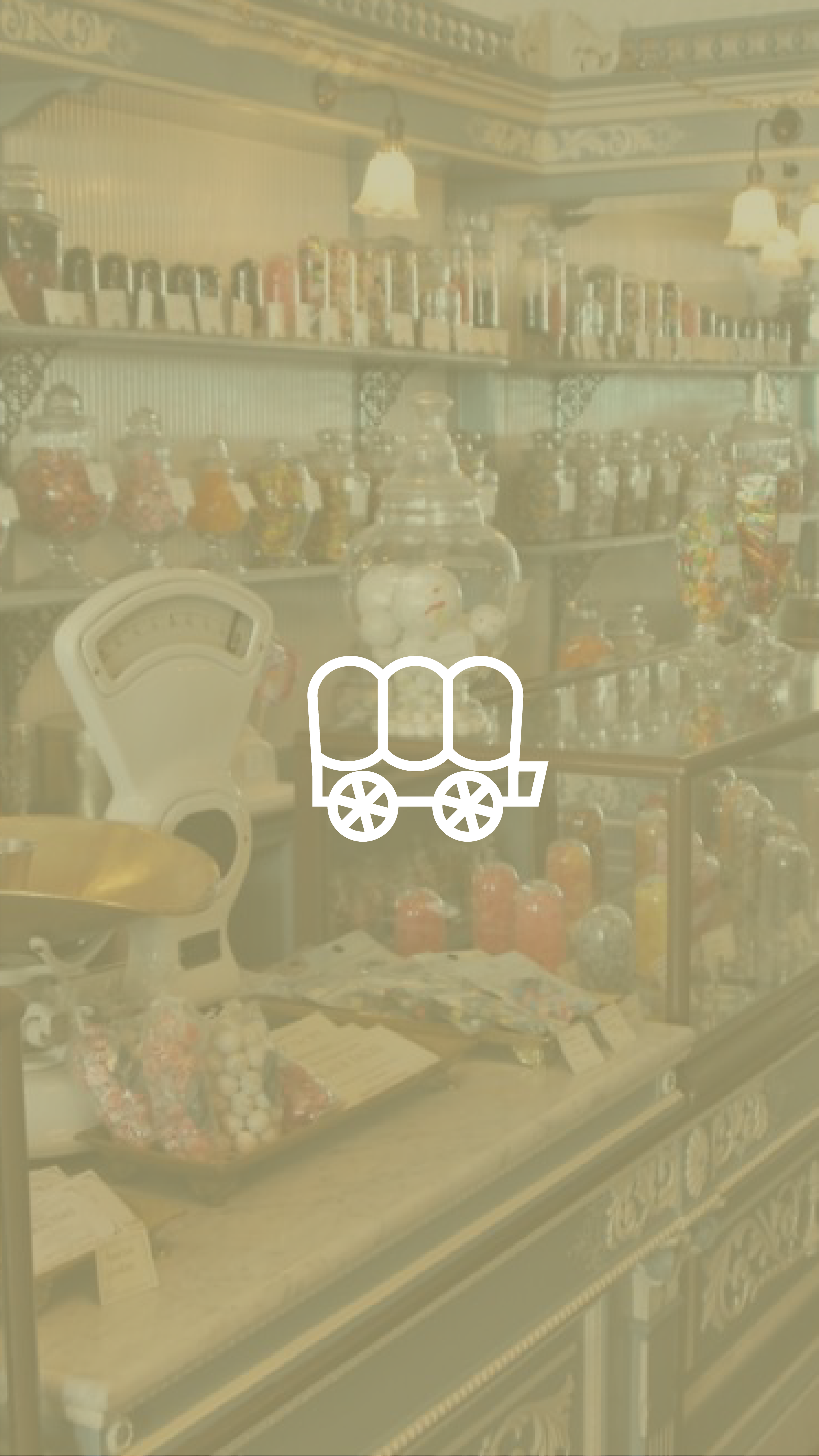
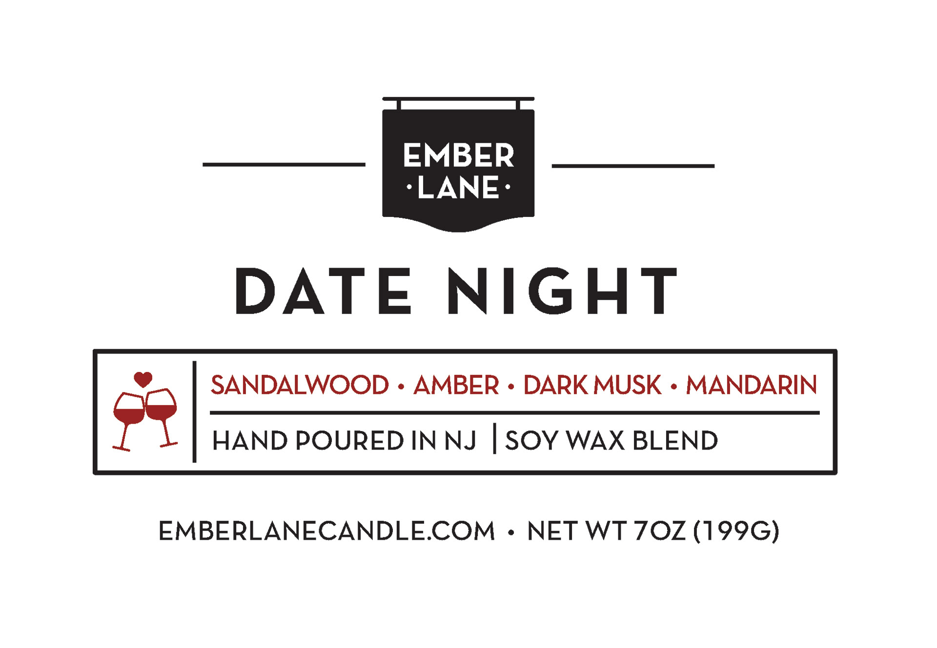
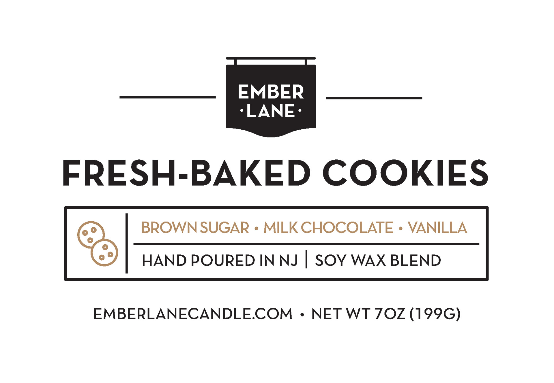
Labels are minimalistic with a different icon representing each scent. The specific icons and colors are carried through in all marketing and branding elements.

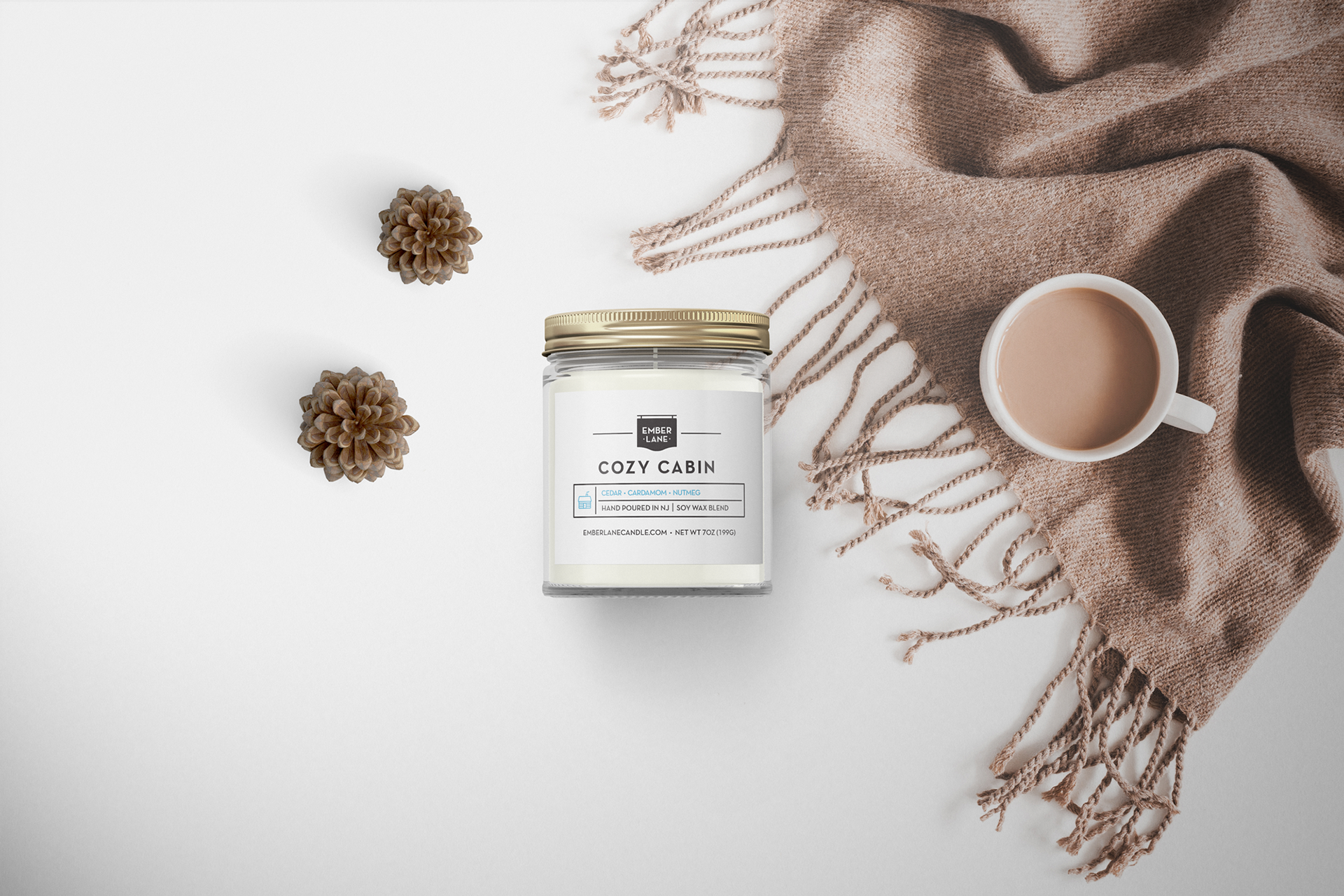
Product mockups were created to quickly communicate the vibe of each scent via related objects and items.


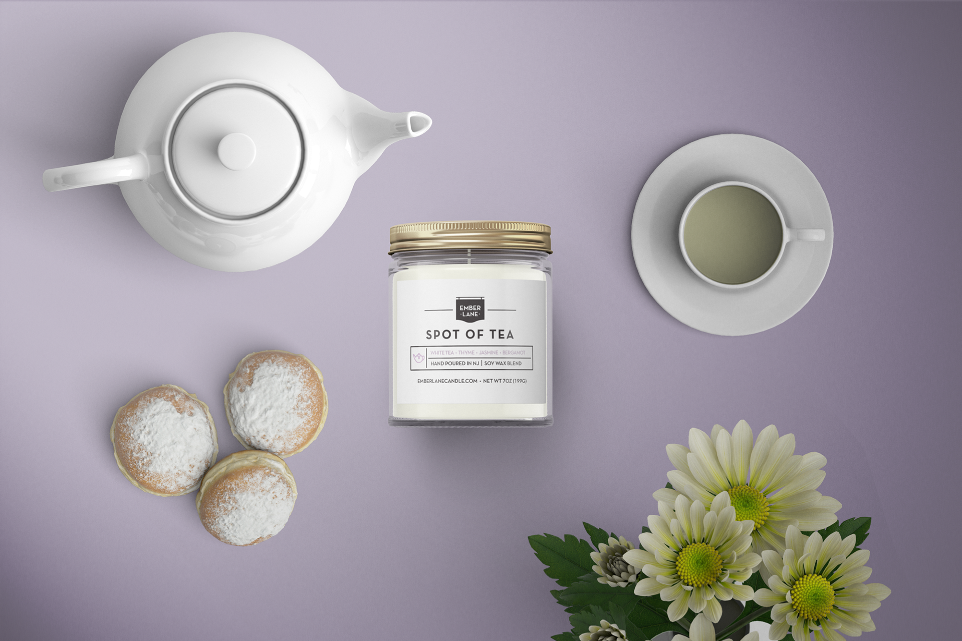
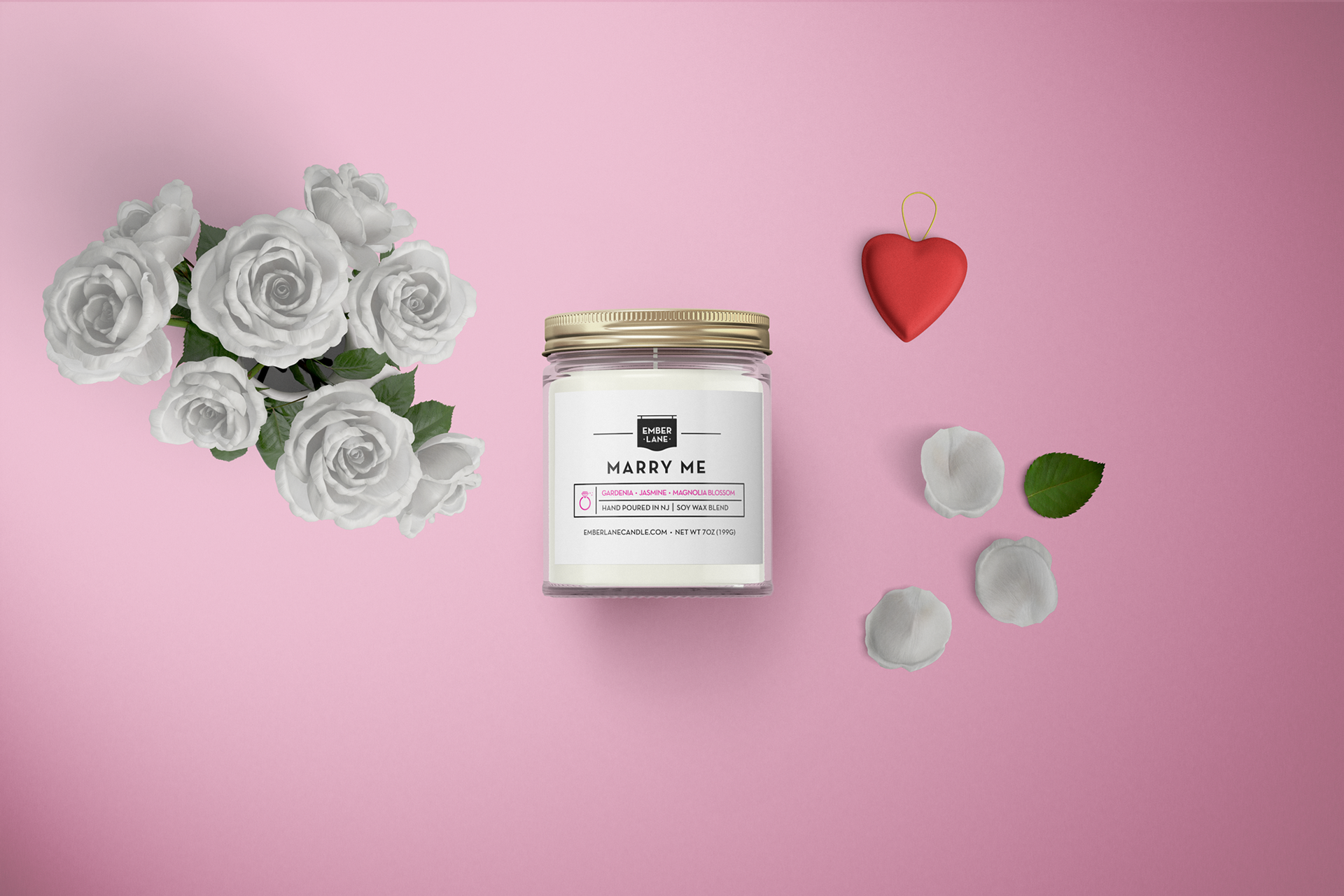
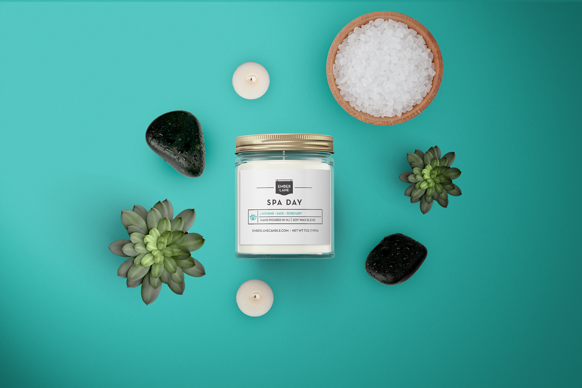

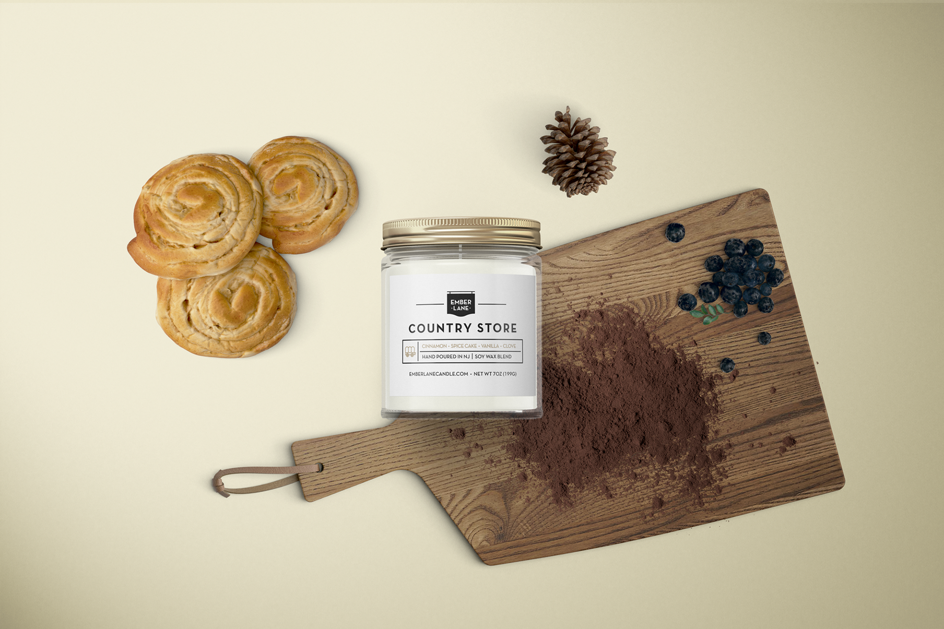
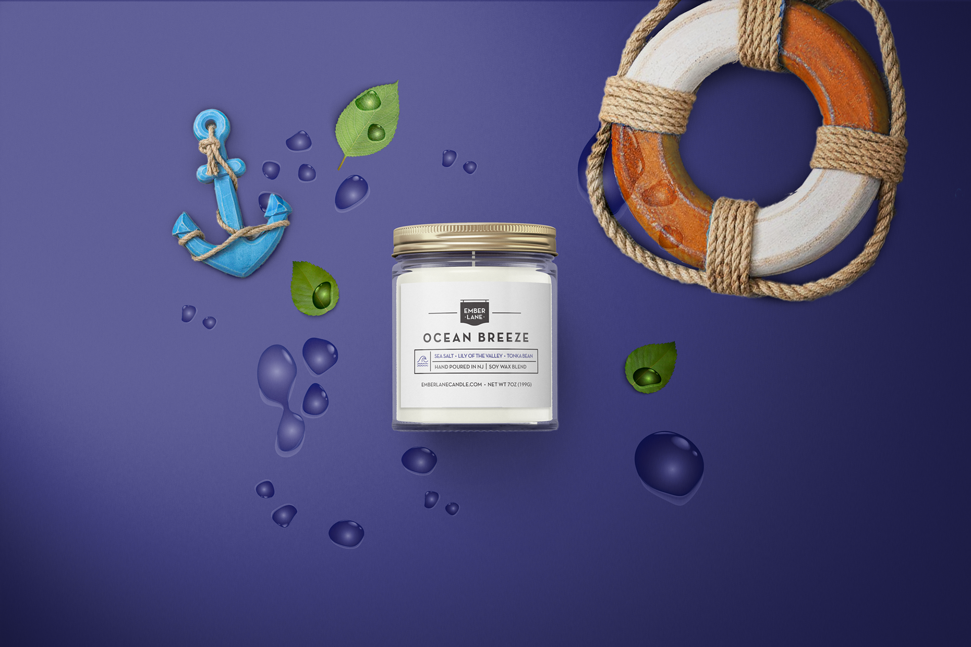
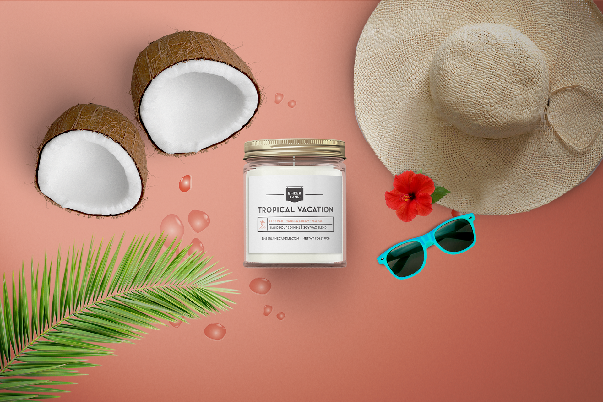

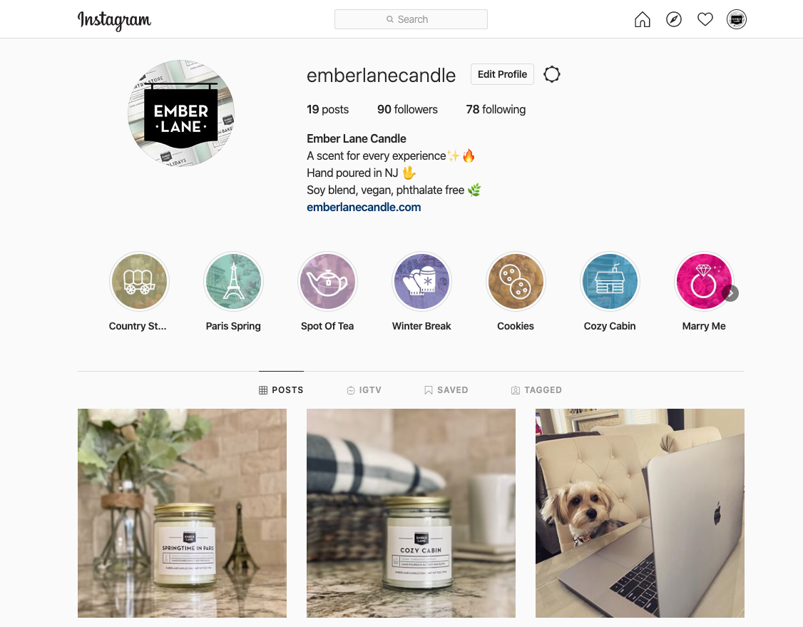
Colorful imagery is used throughout all branding, with each scent having its own cohesive identity. Below are some examples of the graphics created for social media - specifically, highlighted Instagram stories for each scent.